YMCA Life Skills App

Validating a mobile-first financial literacy learning flow in three weeks

Project

Context

This was a three-week team project (4 designers) exploring how a YMCA mobile app could support young adults in developing practical life skills.

The brief was intentionally broad. Our deliverable was not.

Success was defined as shipping one high-fidelity, testable user flow, supported by research and usability testing - and presenting it as a coherent product concept.

This was an academic setting, but we treated scope and tradeoffs as real constraints.

Our final design included:

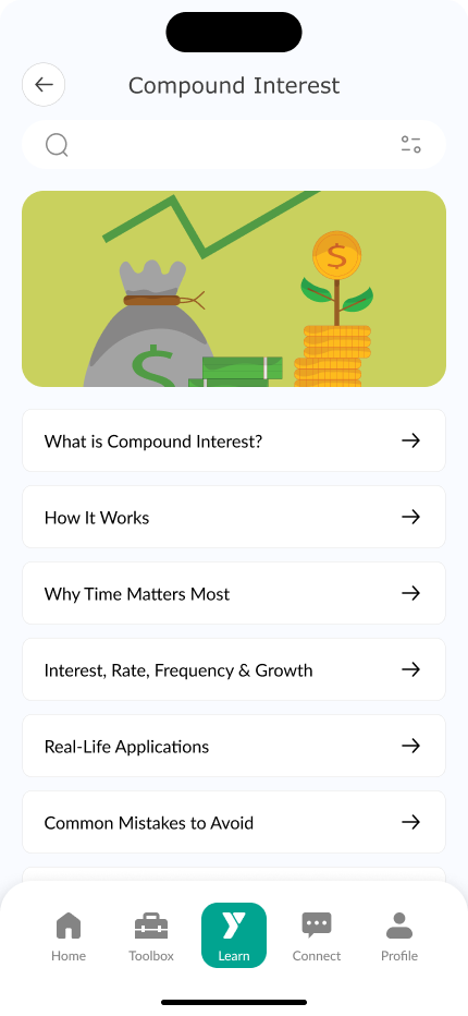
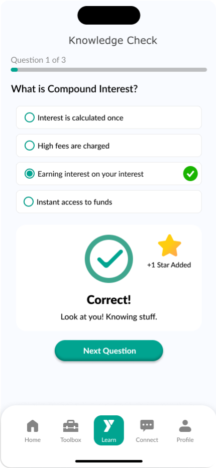
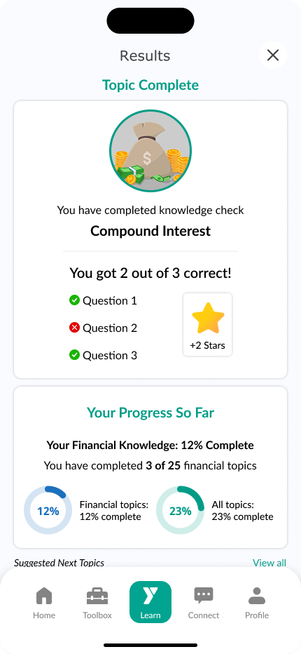
  • A mobile dashboard with visual progress
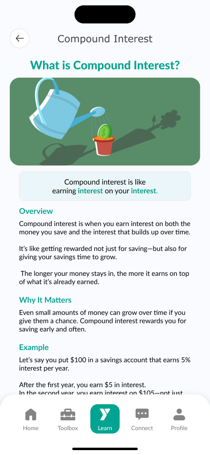
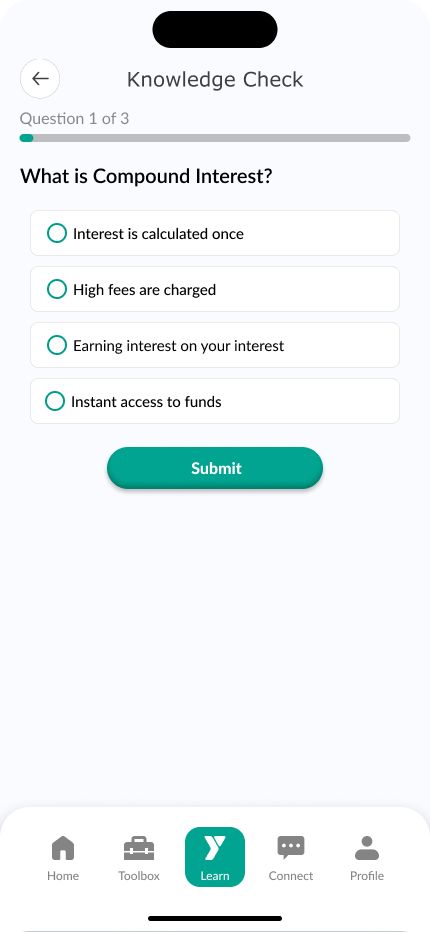
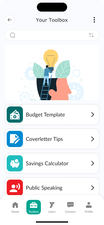
  • Short, digestible learning modules
  • Personalized profiles and saved content
  • A smooth, no-pressure onboarding flow
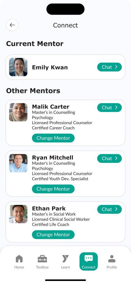
  • A section for mentorship and guidance chats

Delivery Constraints

  • Fixed 3-week timeline
  • One interactive flow required for final critique
  • Mobile-only experience (assumed primary device for young adults)
  • No backend, integrations, or production feasibility considered
  • No direct YMCA stakeholder access

Given this, we prioritized clarity and focus over completeness.

Key Decision

Focus on Financial Literacy

User interviews surfaced multiple life skill gaps (career prep, cooking, budgeting), but financial literacy was repeatedly described as confusing and intimidating.

We chose to narrow scope and validate one concept within that domain rather than design a shallow multi-feature platform.

Other topics were intentionally deferred.

Shipping One Focused Learning Experience

I owned the primary financial learning flow.

We chose to teach compound interest as a contained but foundational concept. The experience was structured as:

  1. Short, digestible lesson steps
  2. A simple knowledge check
  3. A lightweight reward moment

The rationale:

  • Reduce cognitive load
  • Encourage completion
  • Mirror mobile learning patterns users were already familiar with

This approach prioritized engagement and clarity over depth.

Bite-sized lesson structure designed to reduce cognitive load and improve completion rates.

What Shipped

  • A complete end-to-end compound interest learning flow
  • A knowledge check reinforcing comprehension
  • A simple reward loop to close the experience

We also created high-level entry points for:

  • A resource “toolbox”
  • Mentor messaging

These were intentionally shallow - designed to demonstrate ecosystem potential, not production-ready functionality.

What We Deferred

To protect scope, we explicitly did not pursue:

  • Additional life skill modules
  • Social/community features
  • Real-world reward integrations
  • Multiple rounds of post-iteration testing

The largest tradeoff was limited validation. We conducted usability testing on the core flow, but did not have time for a second validation round after iteration.

Secondary features were intentionally shallow, signaling ecosystem direction without expanding MVP scope.

Risks & Open Questions

Two risks remained:

  • Interview demographics skewed older than our target audience.
  • The bite-sized, gamified approach assumed short-form learning preferences without deeper retention testing.

If continued, the next step would be validating whether this learning format meaningfully improves comprehension and follow-through for younger users.

Outcome

This project demonstrates my ability to:

  • Reduce an over-broad problem into a testable slice
  • Make scope tradeoffs under time pressure
  • Own and deliver a focused user flow
  • Acknowledge unresolved risks without over-claiming impact

Rather than designing a full platform, we shipped one clear learning experience and understood its limits.

Like to learn more about this project?

Let's Connect!