The Sword & Board

Creating a Nat. 20 Online Experience for TTRPG Fans

Project

The Quest Begins

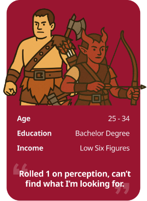
As fans of tabletop role-playing games (TTRPGs) know, a good story is everything. That applies to design too.

For this project, I was tasked to take a local small business, and elevate its online shopping experience. The goal? Keep the soul of a small, community-focused shop—while giving users a smoother, smarter, and more immersive digital journey.

The project asked to take a hard look at the store's usability, restructure its information architecture, and design a mid-fidelity prototype that could be tested and refined.

The Challenge

How might we help TTRPG players browse and buy with ease—without getting overwhelmed or unsure about their purchase?

Discovery & Research

Heuristics

My first move was a heuristic evaluation of the existing site. The verdict: functionally fine, but full of minor frustrations.

  • Inconsistent breadcrumbs and confusing iconography
  • Navigation that didn't always reflect where users were
  • Error messages that didn't connect to the actual errors

Heuristics

Issue

Recommendations

Visibility of System Status

  • Breadcrumbs occasionally doesn't lead back to origin page
  • Main navigation is inconsistent; some pages are highlighted others are not resulting in inconsistent behaviours
  • Update breadcrumbs to show user path
  • Main nav should be consistent with page highlighting

Match Between System and the Real World

  • Product comparison icon; using a refresh icon is confusing
  • Test to see if comparison feature is used. If not, remove it. If it is used regularly a new icon should be found

User Control and Freedom

  • Checkout page doesn't have an easily identifiable way of going back to the main site or shop page
  • Update the checkout page(s) to include a way back; most common is the site logo or a link to “go back to shop”

Error Prevention

  • Site uses toast banners for error messages, Unfortunately they're not linked to the element causing a disconnect
  • Highlight missed fields with the related error message; limit toast banners for more general global errors

Aesthetic and Minimalist Design

  • Elements like social media icons aren't needed in the main nav
  • Social media links can be moved to the footer; separate search, cart, and currency selector from main nav to make a cleaner layout and limit information overload

Competitors

I also ran a competitive feature inventory, comparing local shops like Game Nation and F.G. Bradleys, and even digital-first platforms like Steam.

Steam was included as a indirect competitor since it does compete for a users time and money with a large overlap in the TTRPG audience.

Insights: Sword & Board lacked:

  • Ratings/reviews
  • Clear filtering for compatibility
  • Loyalty program

User Interviews

To better understand what TTRPG shoppers wanted, I interviewed both experienced players and users who had general e-commerce experiences (6 in total). I asked about shopping habits, product needs, and what builds or breaks trust when buying games online.

Key Insights:

  • Information overload was a consistent complaint: “It's like a firehose of text and visuals.”
  • Missing context: users didn't know if items worked with their current campaigns or playstyle.
  • Trust mattered: clear reviews, visible security indicators, and proper stock info were all “must-haves.”
  • The visuals fell flat: users wanted a site that reflected the richness of the worlds they love.
Persona

The TTRPG Gamer

Project Persona.

The TTRPG Gamer loves anything that will expand their game world and enhance their immersion. However finding these items often prove difficult when sites are overloaded with information or missing crucial product details.

Also with the high cost of TTRPG items, they rely on customer feedback and ratings to influence their buying habits.

Behaviours

  • Looks for items related to their current campaign; often favouring a particular rule set or version
  • Looks for highly-rated items to ensure purchase is worth it

Needs

  • An easy way to ensure items works with their campaign rules or version
  • Ensure money spent on high-priced items is well-spent; places high trust in opinions by like-minded players
  • A more stepped approach to product discovery. Current sites are often “fire hoses” of information

Frustrations

  • Finding a new story module or item is not compatible with play-style. Information is either missing or have to click into product details
  • If item is sold out, would like to see that on product list page, not on details

Problem Statement

TTRPG players need a customer-focused online store experience that streamlines product discovery and clarifies compatibility, so they can shop confidently and spend more time immersed in their game worlds.

Information Architecture

I conducted an open card sort to see how users naturally grouped product types. This helped validate some of the current site's categories but also suggested changes:

Card Sort Results

From this, I updated the site map and created a more intuitive user flow—for example, helping users find a new dice set from either search or browse.

Original Site Map

Shop navigation included all types of products, resulting in several dropdowns and information/decision overload.

The main navigation included all their social media links and several sections that could have been grouped under a more general umbrella topic resulting in a overly cluttered experience.

Proposed Redesigned Site Map

Usability in the Wild

I then created a low-fidelity prototype and ran an unmoderated task-based test via Maze.co.
Task: Find and buy a new set of metallic dice

The study included 8 users all completed the task with little to no issues reported.

Results

  • 100% Completion Rate
  • 69.8s average completion time
  • 20% mislick rate
  • One user noted filter usage could be more intuitive—an insight to carry forward
Design

Less Clutter, More Character

From the research that I conducted, I made several key UI choices:

Moved social media icons from the header to the footer to reduce visual noise.

Added filters and “at-a-glance” info to product cards (like stock status and compatibility).

Revised Branding

Used serif fonts to evoke classic TTRPG themes, balanced with modern sans-serif for readability.

Embraced vibrant and saturated colour scheme was chosen to reflect the rich world of TTRPGs. Evoking feelings of warmth in a tavern to the gold and jewels from treasure.

Fantastic! Really easy to follow.
I don't have a lot that I would have changed.

– Maze participant

Level Up!

What Was Built

I focused on:

  • Homepage with improved category access
  • Product listing with filters and stock visibility
  • Product description with rich detail and trust signals
  • A smoother checkout process with clear wayfinding

Note: A Desktop prototype was developed as an MVP. Full prototype can be seen on a larger screen.

Final Deliverables

  • Clickable prototype in Figma
  • Full research & IA documentation
  • Wireflows & user flow
  • Presentation slide deck

Reflections

  • This was the project where UX tools like card sorting and heuristics clicked for me
  • Information overload is real. Small changes in structure made a huge impact.
  • Testing matters. Watching real users explore the prototype helped validate my assumptions.

Next Steps

  • Perform another usability test to verify my redesign or make further changes
  • Build out a blog or storytelling section for game inspiration and highlight the community aspect of TTRPGs
  • Explore mobile view and determine how best to display their catalogue while keeping the goals of discoverability in mind

Like to learn more about this project?

Let's Connect!